
The #30DaysChartChallenge
Create a data visualization based on the daily prompt and share your work with the hashtag #30DayChartChallenge
Comparisons / Fractions
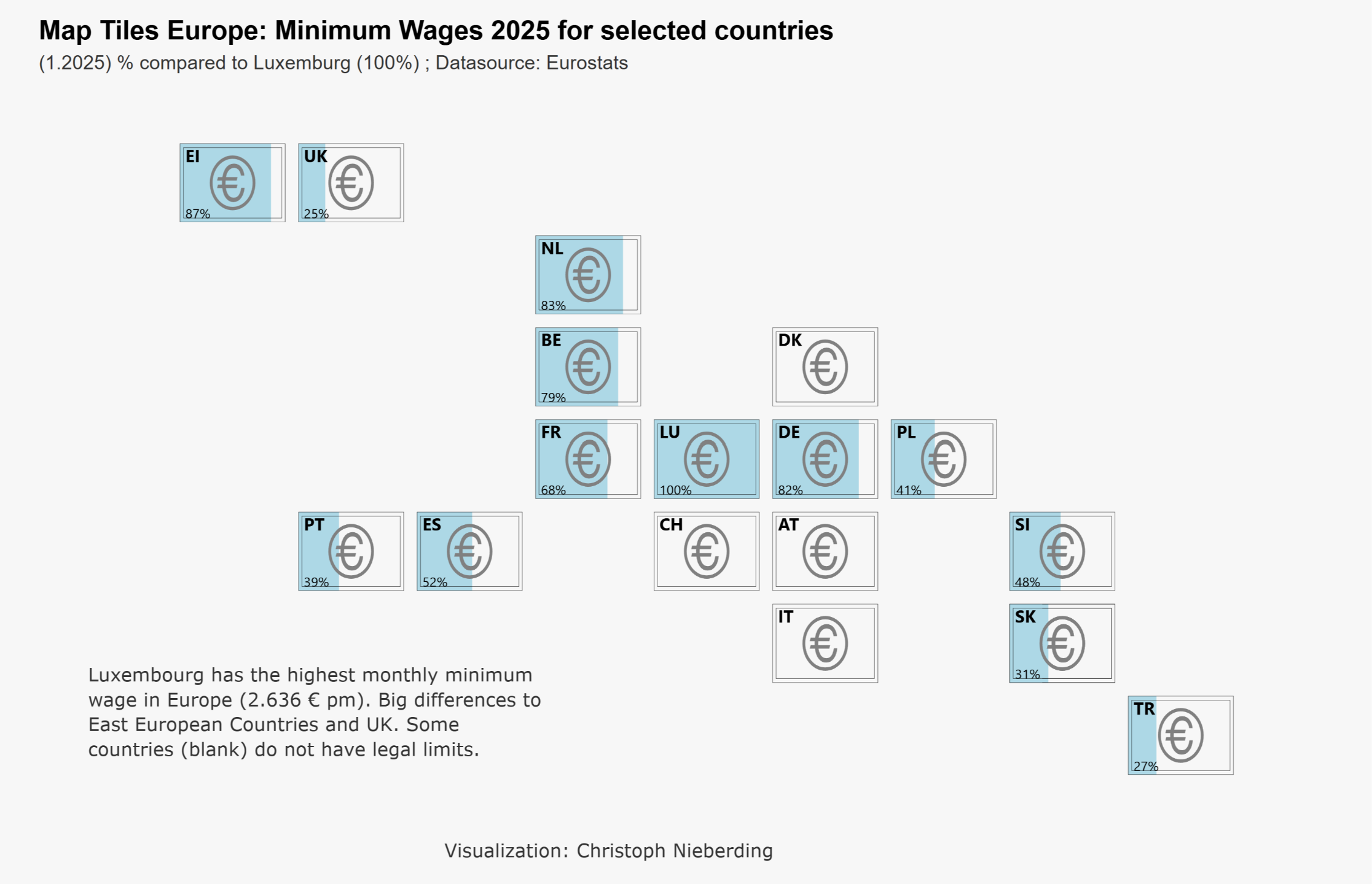
I provide map tiles for some European countries, showing minimum wages in a Euro bill symbol, filled as related to the highest minimum wage in Europe Luxembourg (100%). Some countries really have no minimum wage like Austria and Switzerland.
I took the D3.js visual from the marketplace for its implementation.
All data from Eurostats: https://ec.europa.eu/eurostat/data/database
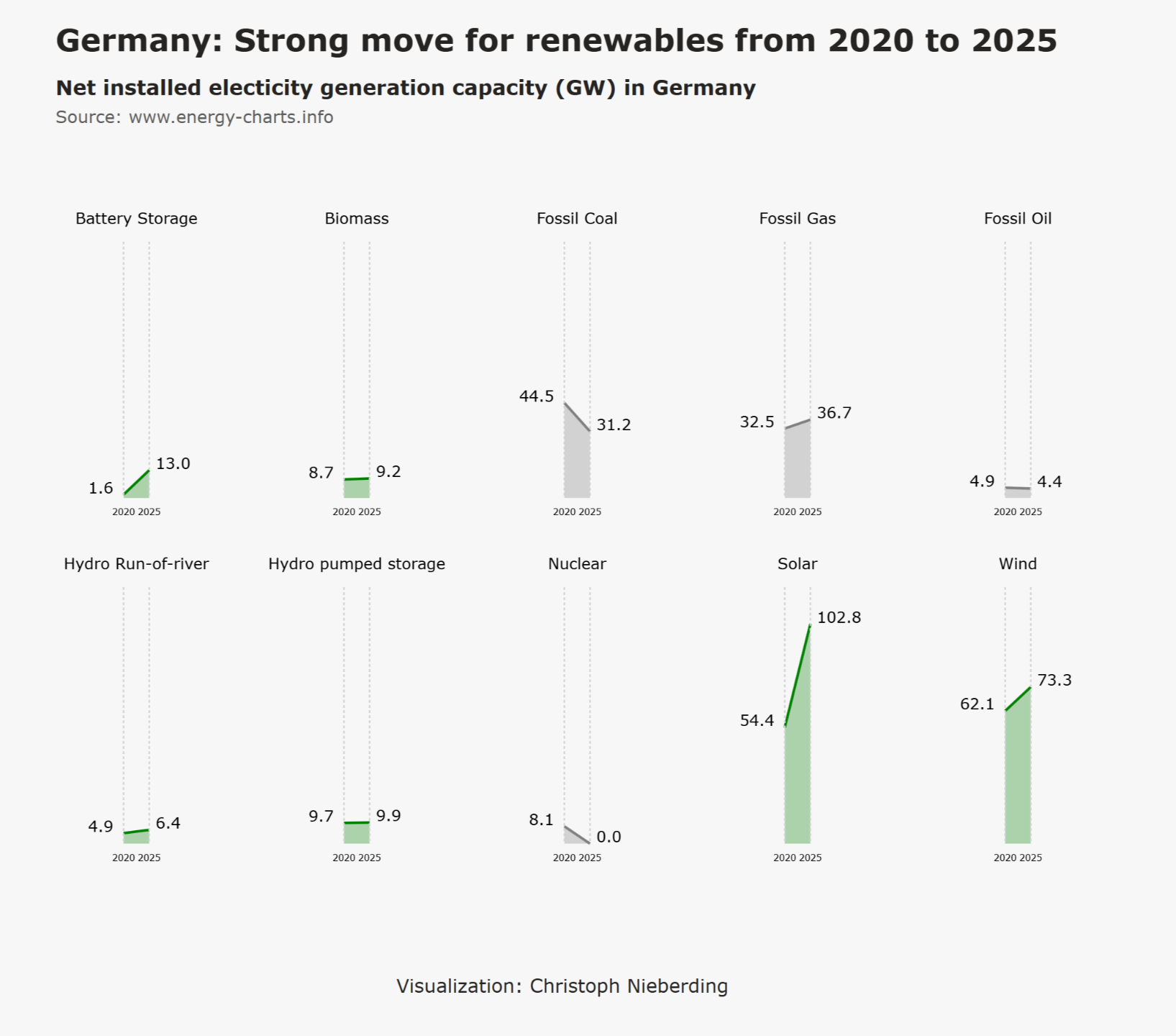
Comparisons / Slope
When you want to show change between two points in time, slope graphs are a powerful choice. They are simple, clean, and easy to understand — even for people who are not data experts.
This is about the energy change and industry transformation in Germany (Link).
Realization with DENEB visual (open source) from the marketplace.
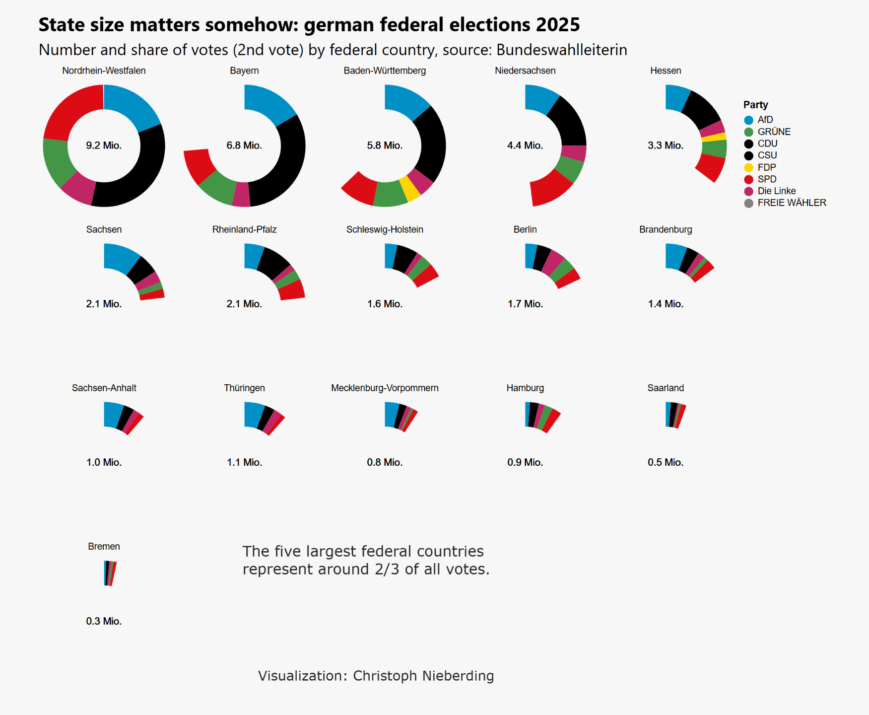
Comparisons / Circles
Circles are perfect shapes and beautiful, sometimes a little neglected in data visualisation. But they are powerful in conveying simple but important messages.
Here is an example of the different weighting of our federal states in the last federal election. In Germany, local issues count a lot if it comes to party preferences (Link to the datasource).
Realization with D3js visual (open source) from the marketplace.
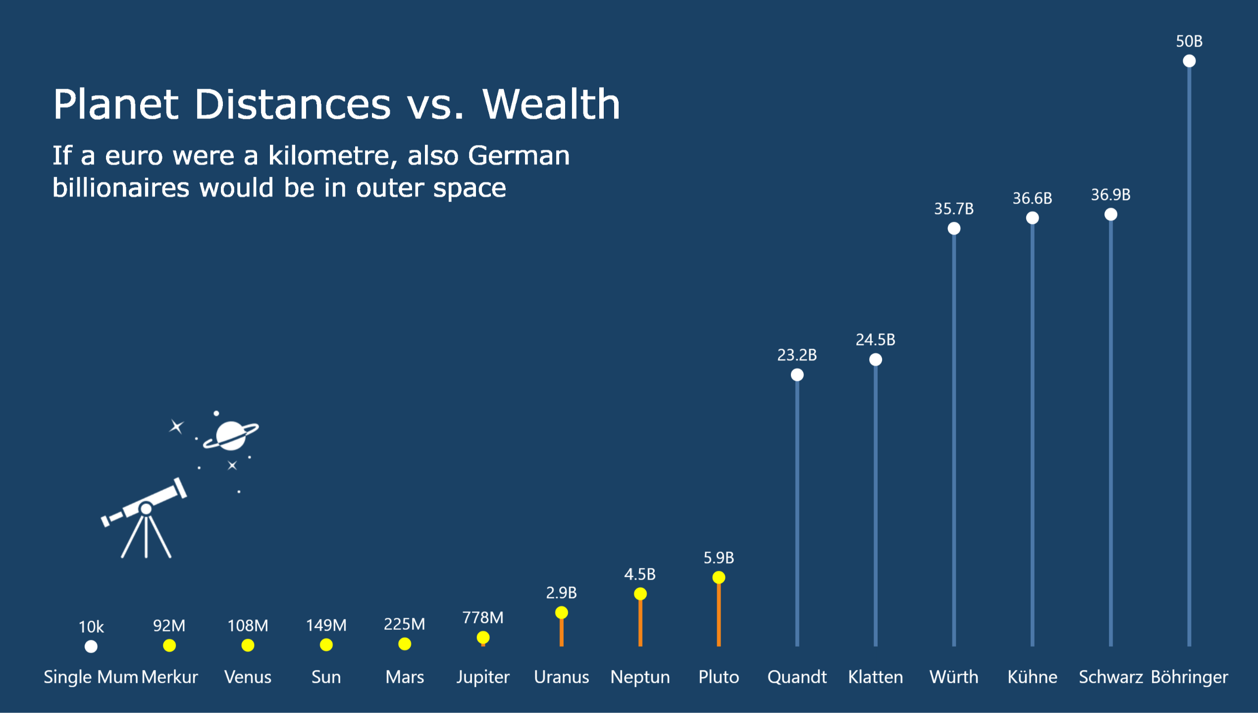
Comparisons / Big or Small
Big numbers are often hard to relate to. How much is a billion fortune? Thousands okay, millions somehow, but billions? How can I explain that amount in a meaningful way?
So I tried Heath/Starr's "Making Numbers Count" approach 😅 (book recommended).
Realization with DENEB visual (open source) from the marketplace.
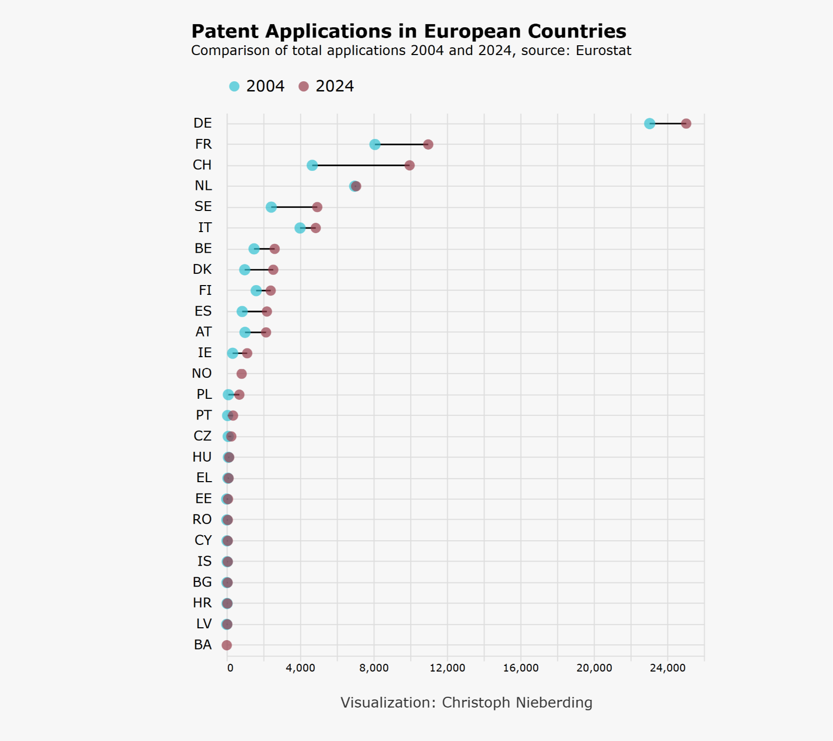
Comparisons / Ranking
Germany is currently being seen as kind of lazy and fallen behind in international context. But patent applications are not. Impressive big shift by CH.
This chart is inspired by the chart of the famous Big Mac index chart made by The Economist. Data is again from Eurostat.
Realization with DENEB visual (open source) from the marketplace.
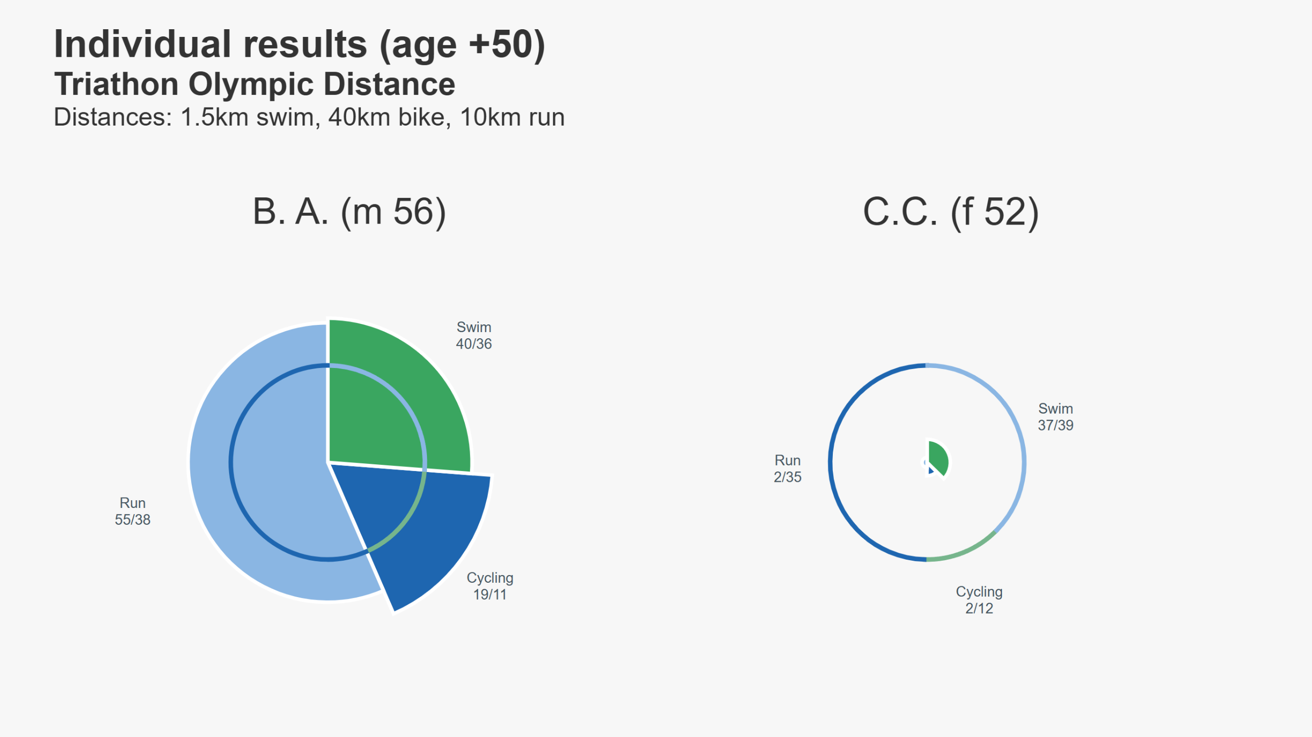
Comparisons / Nightingale Theme
Florence Nightingale was an English social reformer, statistician and the founder of modern nursing. Nightingale came to prominence while serving as a manager and trainer of nurses during the Crimean War, in which she organised care for wounded soldiers at Constantinople.
Realization with DENEB visual (open source) from the marketplace.
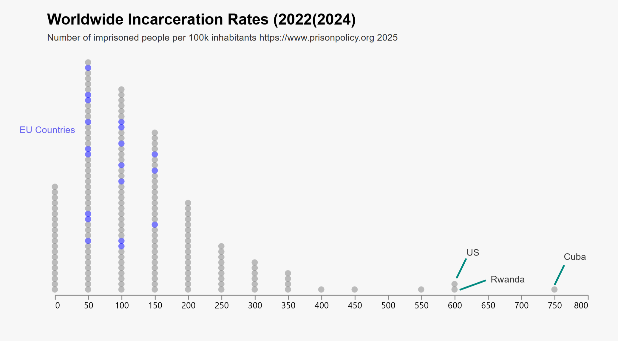
Distribution/ Outliers
A key goal of data visualisation is always to identify patterns. And patterns become visible when they are broken: Outliers. Then you can see, for example, that something is really not working.
Realization with DENEB visual (open source) from the marketplace.
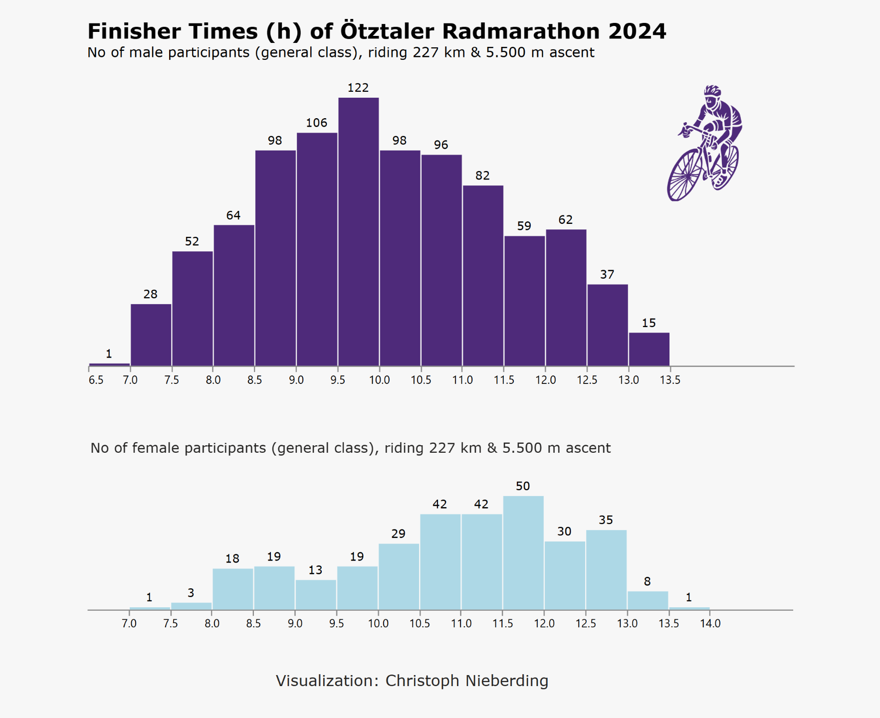
Distribution / Histogram
Continuous data are for histograms. Helps to reveal skewness, central tendency or outliers. This makes them particularly useful for understanding the shape and spread of data sets at a glance.
The data are about the most famous non-prof cycling event in core Europe - the Ötztaler Radmarathon. 220 km ride and 5.500 meter of ascent. I took the 2024 result of the general class for men and women.
Realization with DENEB visual (open source) from the marketplace.
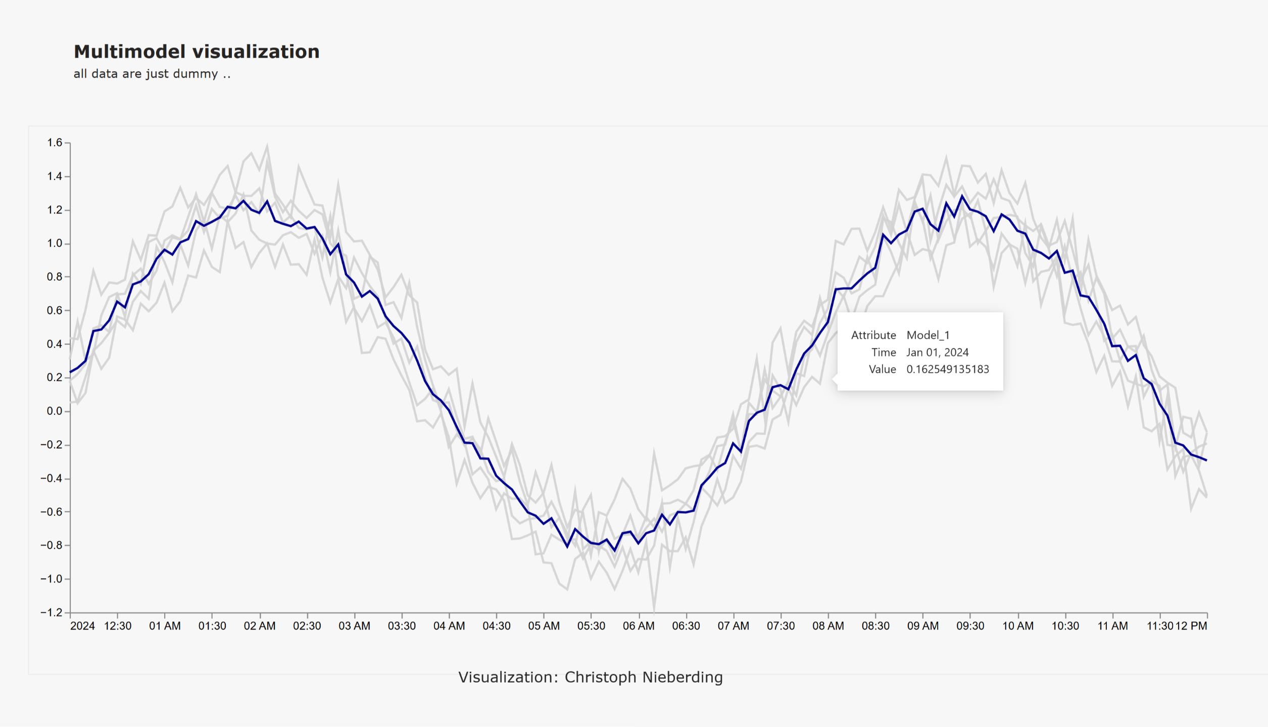
Distribution / Multimodel
To display several lines that are close together, it is necessary to separate them visually. Hovering over the selected line highlights and displays the local data with a tooltip.
Realization with D3js visual (open source) from the marketplace.
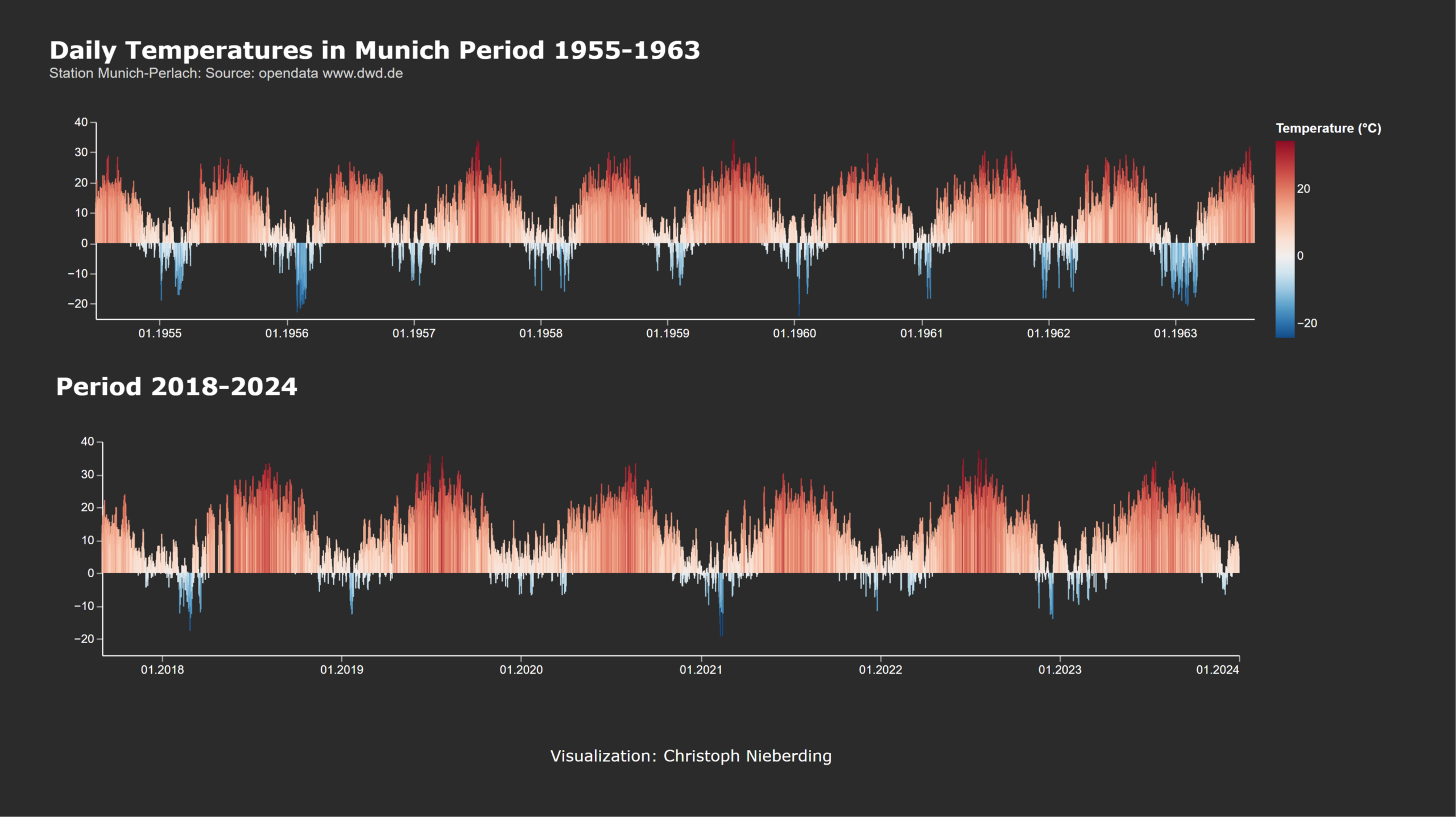
Distribution / Stripes
Climate scientist Ed Hawkins created the iconic “warming stripes” to show global temperature changes in a clear, visual way. Each stripe represents one time frame, with colors shifting from blue (cooler) to red (warmer) — making time series instantly understandable.
These visuals have become a powerful symbol in climate communication, helping to raise awareness and spark conversation worldwide.
Realization with DENEB visual (open source) from the marketplace.
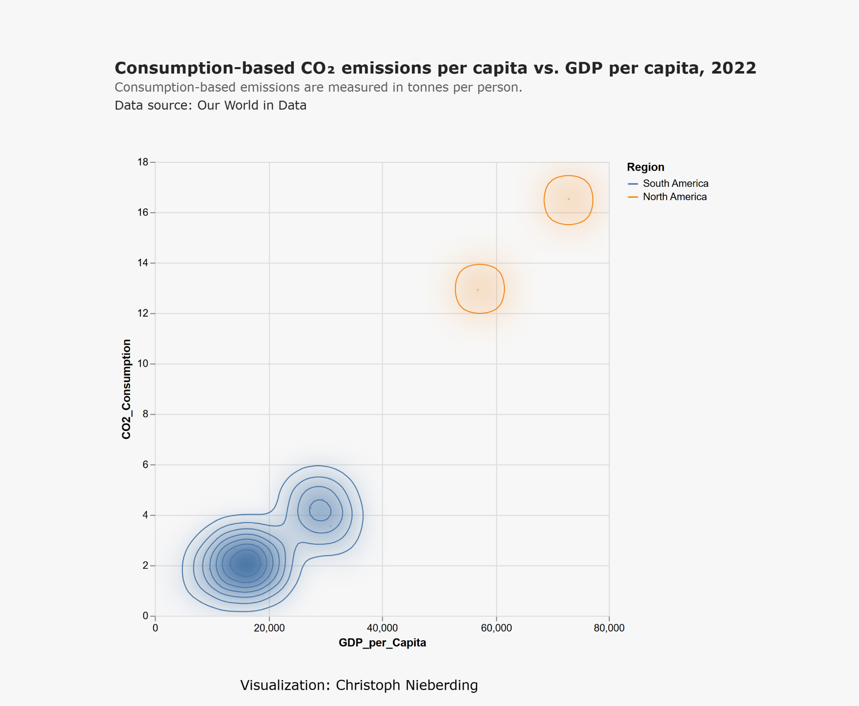
Relationships / Cluster
The original version for the contour plot in Vega-Lite shows the relationship between horsepower and fuel efficiency (miles per gallon) for cars from the USA, Japan, and Europe.
This example here is an adoption to GPD per Capita and the CO-2 consumption for Sout and North American countries. With having a dense spread it's working properly.
Realization with DENEB visual (open source) from the marketplace.
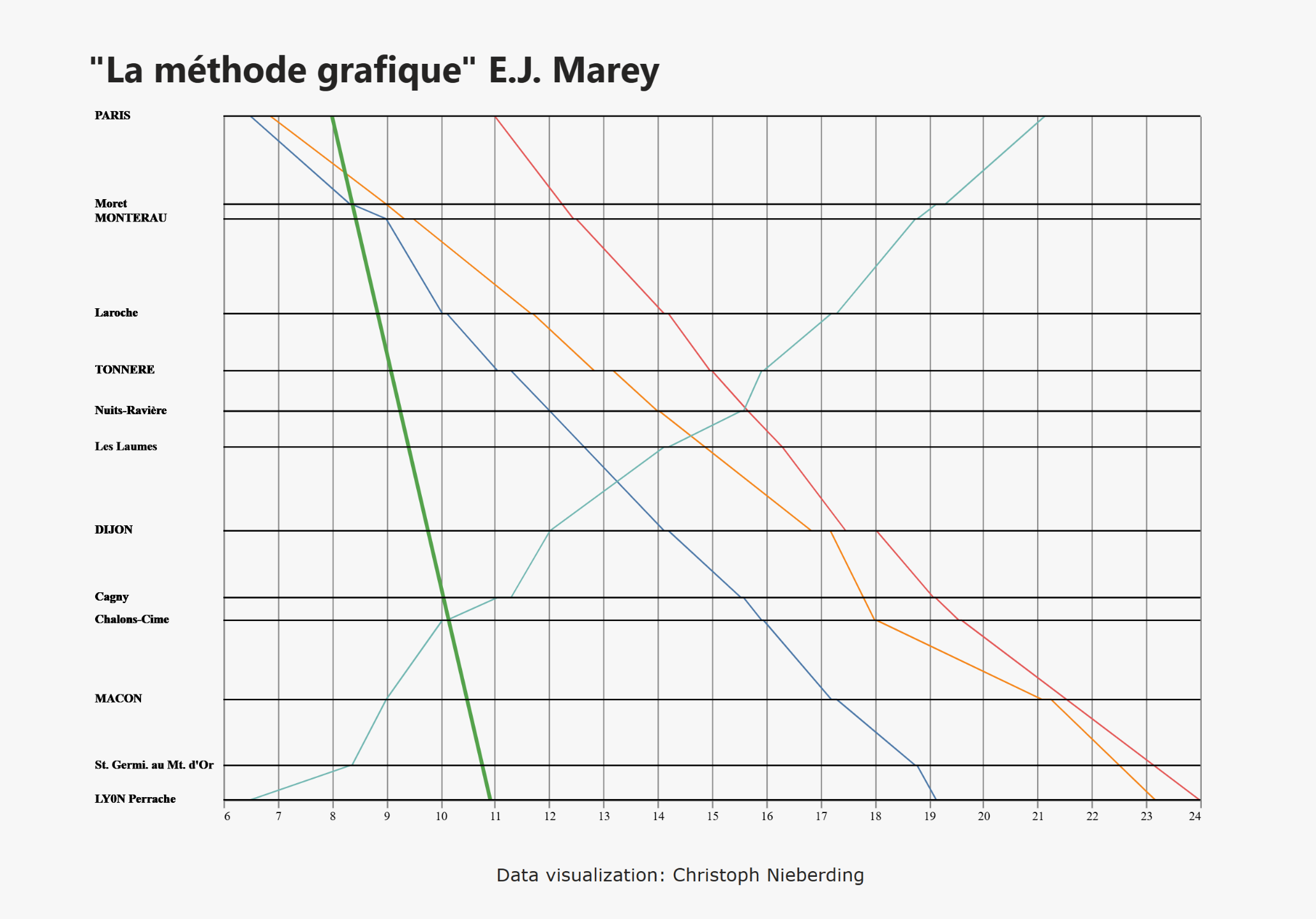
Relationship / Complicated
Étienne-Jules Marey was a 19th century French engineer, physiologist and pioneer of data visualisation. He developed innovative graphical methods for capturing movement (people dancing, people running), often using diagrams and even early photography.
This chart is a digital remake of the famous train timetable from Paris to Lyon, printed in Tufte's book "The Visual Display of Quantitative Information".
Realization with DENEB visual (open source) from the marketplace.

Relationship / Negative
This one is inspired by the great work of Hans Rosling. Having a look at the result, I've never seen such a strong correlation (the y-scale is logarithmic) in the data I work with.
Rosling taught us that the world is not what we think it is. As a Swedish physician and data visionary, he brought global statistics to life through powerful, animated visualisations. In his book Factfulness, he encouraged people to see the world based on data, not fear - showing that many global trends, such as poverty and health, are improving over time. His work is a rallying call to replace outdated worldviews with a fact-based perspective based on curiosity and optimism.
Realization with DENEB visual (open source) from the marketplace.
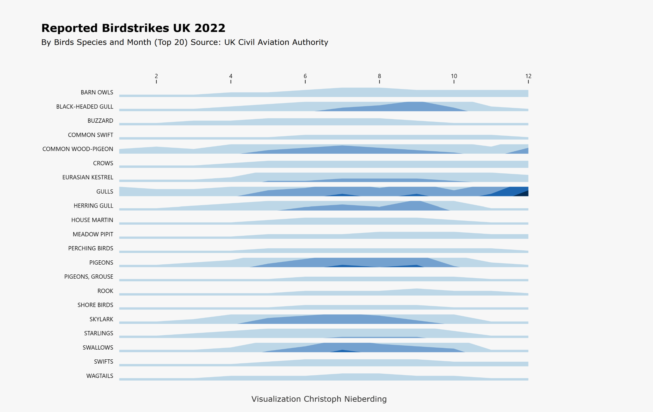
Relationship / Negative
Bird strikes on airports in UK (2022) - This chart is a complete makeover of a an overwhelming stacked bar chart found in the 2022 annual report which in my opinion provides only minimal user experience and data value. I decided to put all the data in a horizon chart.
Horizon charts are great for showing multiple time series in a limited amount of space. Sometimes, you really don’t have much room but still want to show the density or intensity of events over time. The trick is to split the y-axis into bands (often quartiles or other intervals) and layer them using color intensity — darker shades represent higher values. This helps readers quickly grasp patterns and distributions without needing a lot of vertical space.
Realization with D3js visual (open source) from the marketplace.
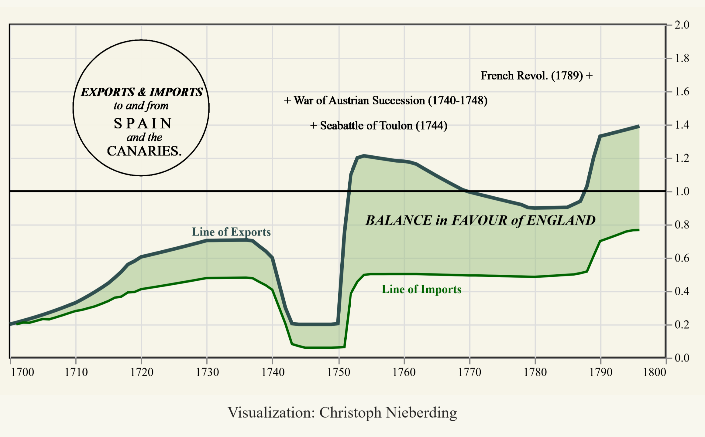
Timeseries / Smooth
This is a remake of a famous type of chart introduced in 1786 by William Playfair in his book "Commercial and Political Atlas". WP is credited with introducing graphical methods to statistics.
Realization with DENEB visual (open source) from the marketplace.
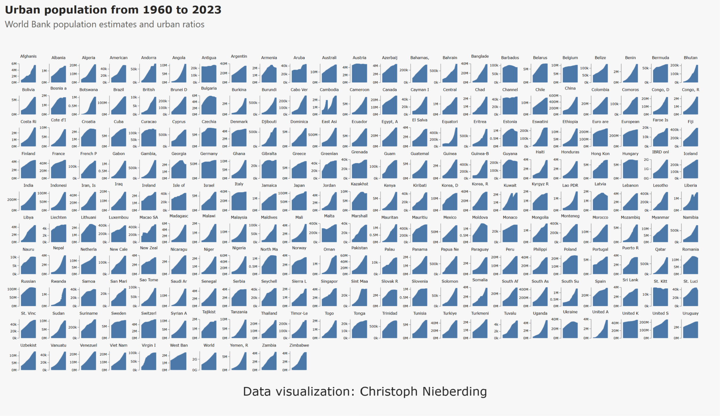
Timeseries / Urbanisation
Big question: how to explain the 'world'? Small multiples are a powerful way of providing an overview of important developments over time, while still providing the opportunity to delve into detail if required.
Realization with DENEB visual (open source) from the marketplace.
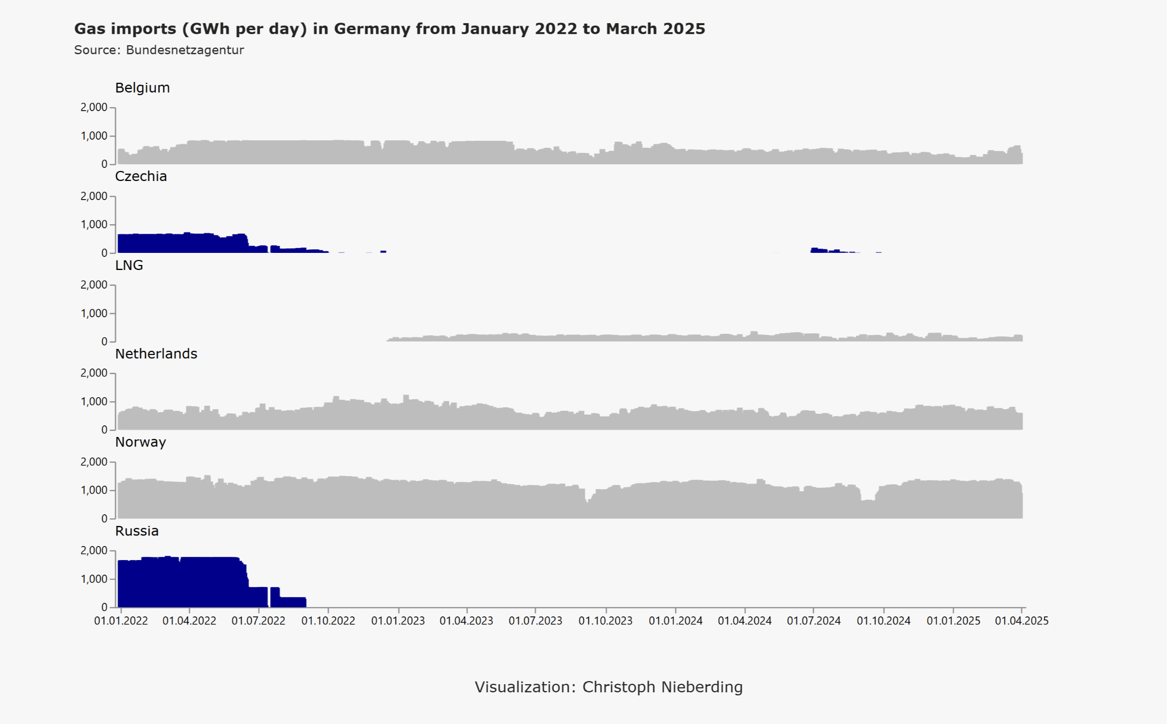
Timeseries / Fossils
Realization with DENEB visual (open source) from the marketplace.
